Big Data: Information visualization techniques

We recently explored the Big Data visualization principles. Now it’s time to delve deep into Big Data visualization techniques and find out which one is appropriate for various use cases.
Two-dimensional (2D) area
Such visual forms are mostly geospatial, which means they represent some certain geographical location on the globe.
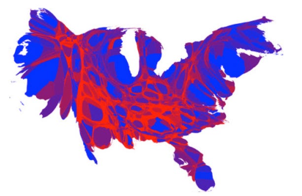
- Area or distance cartograms are the copies of some parts of maps, depicting some additional parameters like demography, population size, traveltimes and any other variables.
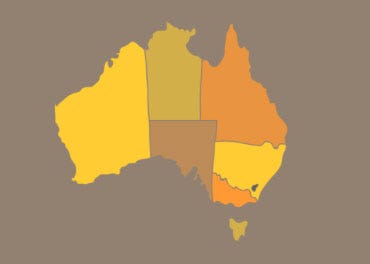
- Choropleth is a map colored with different colors depending on the level of the examined variable, like the sales level per state or the biggest inventory stocks per state.

- Dot distribution map is the data visualization method relying on using thedots to highlight the level of presence of the examined variable within the area.This map, for example, shows the coverage of the US toil with McDonald’s restaurants and the distance between them. You’d have to ride for 145 miles in South Dakota to order Chicken McNuggets!
2D area data visualization methods help a ton when evaluating large-scale data like demographics, voting results, tourism and business growth rates, etc. However, they are not suitable for depicting the data values for a single company or the information that has no geospatial connection. This is where multidimensional data visualizations come into play.
Multidimensional data visualizations
This type of big data visualization approaches is one of the most widespread, as it combines two or more dimensions to produce easy to grasp images.
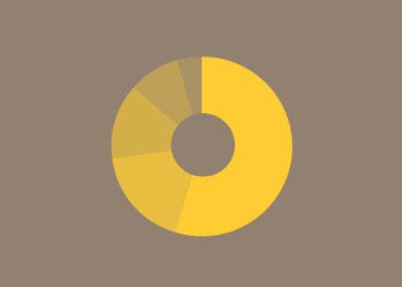
- The pie chart is among the most popular tools for data representation. It is split into sectors illustrating some numerical values, with the angle and the arc length in each sector being proportional to the value represented.
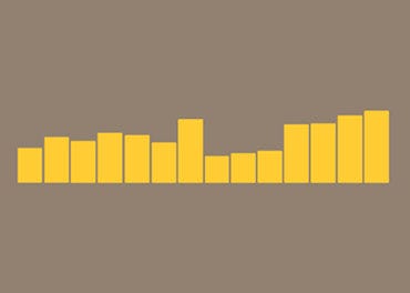
- The histogram is a series of rectangles, representing both the time periods (width) and the parameter values (height), which helps clearly grasp the dynamics of the parameter adjustments.
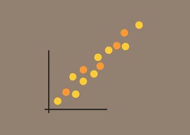
- The scatter plot is the model of data visualization depicting 2 sets of unconnected dots as parameter values.
While such data visualization techniques are extremely useful for depicting the values from a single data set, they are of little help when comparing two or more different sets. Hierarchical data visualization comes to our aid in this case.
Hierarchical data visualization
Sometimes it’s important to show how one set of data values compares to another one or more data value sets.
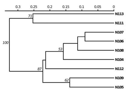
- A dendrogram is an illustration of a hierarchical clustering of various data sets, helping to understand their relations in an instant.
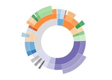
- A sunburst chart (or a ring chart) is a pie chart with concentric circles, describing the hierarchy of data values.

- The tree diagram allows to describe the tree-like relations within the data structure, usually from the upside down or from the left to the right.
These forms of data visualization are mostly useful for depicting the hierarchy or relations of different variables within the data set. However, they are not too suited for showing the relations between multiple data sets, as network data models work best for such matter.
Network data models
When we need to describe the way various data sets compare and relate to each other, network data visualization techniques come to our help.
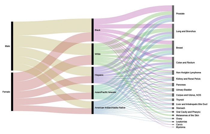
- An alluvial diagram is the example of a flow diagram that represents changes in the data structure over time or under certain conditions.
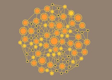
- A node-link diagram is usually a circular image with dots representing the data nodes and lines representing the links between said nodes. This helps visualize the relations between the data sources and understand what results are based on what data.
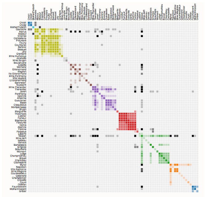
- A matrix diagram or chart is used when we have multiple data sets connected to each other via some relations. Matrix helps show both the data set positions against each other and the relations between these sets.
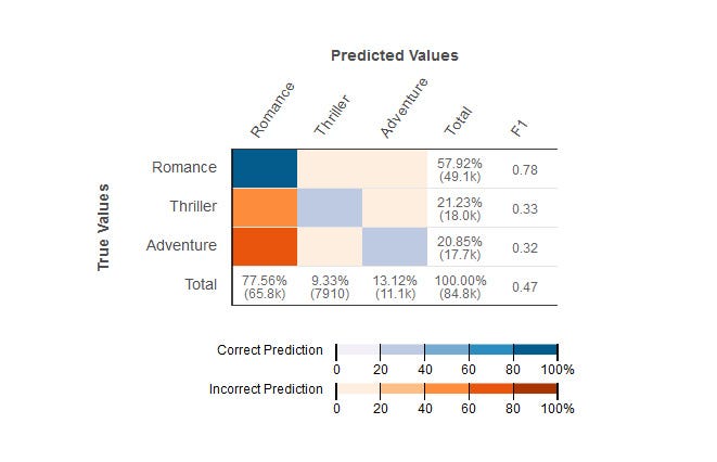
Another great example of such a matrix is how Amazon ML uses the color legend to actually depict the degree of the value connection.
Temporal visualizations
While looking quite like simple linear graphs, temporal visualizations include a start and finish time and some of the items measured might overlap, thus creating a descriptive image shoving the variable adjustment over time.
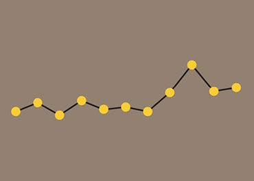
- Connected Scatter Plot is the plot of values for two variables taken from a data set. These values are scattered throughout the picture and connected with a line.
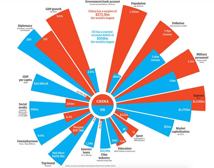
- Polar area diagram might look like a standard pie chart, yet the size of the sector is evaluated by the distance from the center in addition to the arc length and angle. Thus said, a sharp sector stretched far away from the center might be more important than a blunt sector that does not reach far.
Source: The Guardian: China vs the US comparison
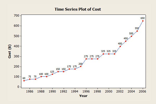
- Time series is the most often used example of continuous data evaluations over a period of time. The graph of CPU usage, the number of website visits over a month and a plethora of other historical data are best described using this data visualization technique. For example, the time series graph below shows that the Super Bowl ticket cost grew 13 times in 20 years from 1986 to 2006!
These 15 data visualization models are merely the tip of the iceberg. There is a huge variety of techniques available, depending on what result has to be shown:comparison of several data sets, their composition, distribution of data within said sets or relationship between them. While the sheer amount of data visualization techniques might seem overwhelming, we hope you agree viewing graphs is always better than looking at rows of numbers.
The article was originally published here.
